Project
Hampton & Marosz Wedding Invitation
Overview
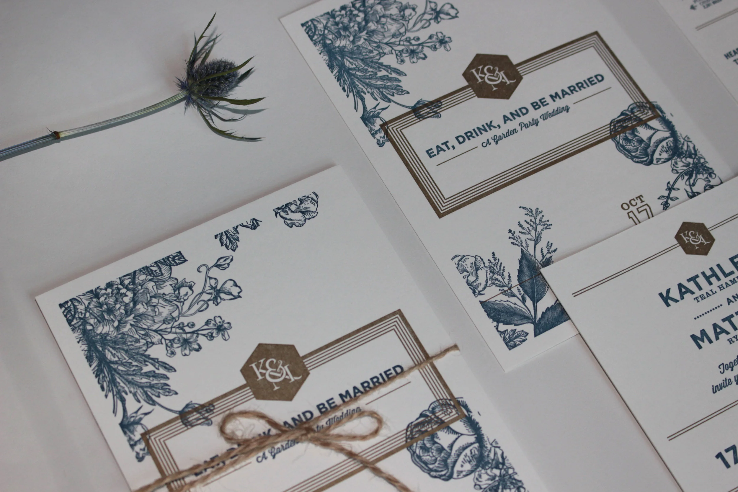
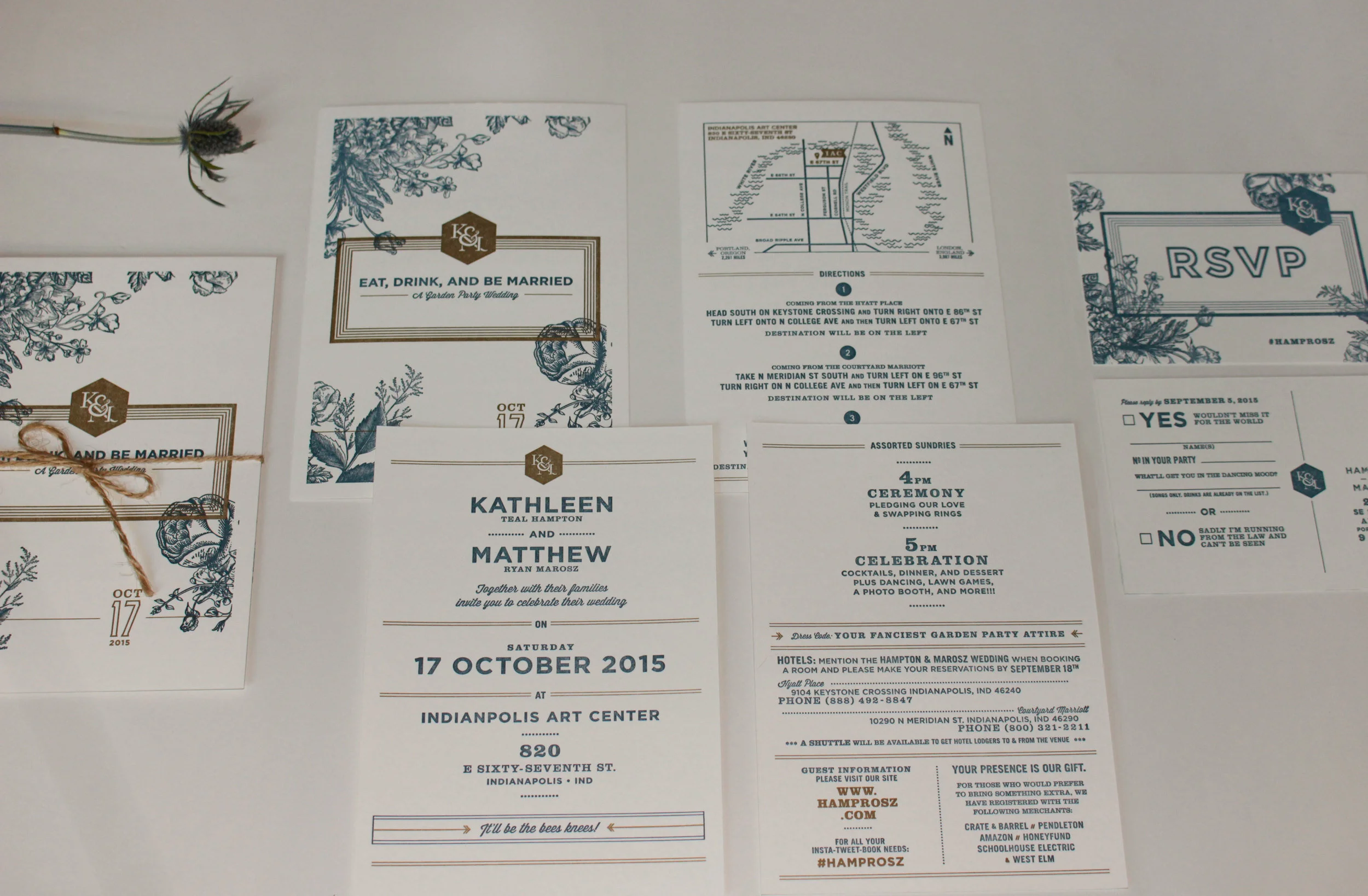
For my wedding, I worked closely with my wife-to-be to design our bespoke wedding invitations. We wanted this invitation to be a celebration of our personalities, to be a keepsake for the day, and to have a timeless feeling to it. Knowing that our wedding was centered around the theme of a garden party, I designed a bespoke K & M monogram and found some vintage floral illustrations to use. Adding the Navy and Gold from our colour palette helped give this invite a contemporary feeling, while the typography was chosen to clearly communicate the information and provide an additional tone of fun and garden party sensibility. From type to colour and illustration to paper choice, we sought to not just showcase our personalities but create a balance between our shared aesthetic of vintage and modern.
To me, letterpress is one of the most beautiful things. I love the smell of fresh ink on paper and that tactile sense of wood type pressed into paper. After working on these for a while, I knew they had to be letterpressed. I selected Crane Lettra 220# Pearl White and French Pop-Tone 140# Whipped Cream as our paper. The inks were hand mixed to match Pantone 540 and Pantone 871. The full invitation suite was printed by the talented Keegan & Meegan Co.


